
ServiceDesk 4.8.217 Update 5/27/21
New Style Options for DispatchMap Route/Vector Lines (Especially Helpful for Larger Operations)
In very early ServiceDesk, the DispatchMap featured simple lines to signify the intended sequence between each graphic job reference in a tech's roster.
Plain lines had a drawback in that they did not indicate in which direction was intended for the sequence. Thus, in this image:

It is not possible in the above to tell if the sequence of stops will be S-Johns-->G-Mulli-->Jones-->Abernat, or if it will be the opposite. We addressed this limitation by changing to vectored lines, like this:

Though we felt this was an obvious improvement, some users preferred the plain lines, so we made it an option to retain those instead
The above has been our state-of-the-art, in regard to such lines, ever since.
Until now!
As everyone knows, the set of jobs that are assigned to any tech, within the DispatchMap, show that assignment by displaying in the color that is that is uniquely assigned to that tech. At least, that is how it works if yours is not an operation that has more than 18 techs. If you indeed have more than 18 techs, this scheme somewhat unravels.
It's because there is a limited pallet of colors that may effectively be used in this context. We need, in particular, colors that can readily be distinguished one from another, which contrast well against a white background, and which are not overly harsh to the eyes when displayed on a computer screen. Try as we might with various mixes of red, green and blue, we at Rossware have been unable to formulate more than 18 such color variations.
Because of this, we have offered only 18 different colors from which to select for display of each tech's job set within the DispatchMap. It's fine, if you have 18 techs or fewer, but, if you have more, you end up having to repeat use of particular colors for more than one tech. Especially for companies that have 40 or 50 or 60 techs, this can make it difficult to distinguish which tech it is whose route you are looking at (in particular, between multiple techs who are assigned the same color). Is this the magenta of Jeff's route, or the magenta of Bob's route, or the magenta of Jill's route?
This new feature is offered as rescue for that situation.
You may now pick from among four different styles of vectored lines:

(You can still pick plain lines too, if desired)
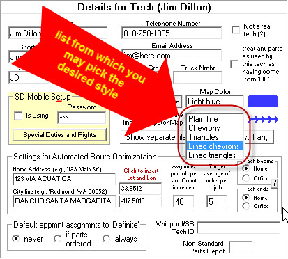
Naturally, the place to pick a desired line-vector style for each/any tech is in the Technician Properties window for that tech, as accessed from within the (Ctrl-F1) Settings form. Just click on any tech's name within the roster of technicians, and the Technician Properties window will appear for that tech. It has a new place for this selection:

When you click in the box that indicates style, you'll see a list from which you may select the desired style:
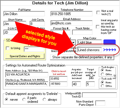
So that you know what you've picked (and what it in fact looks like), the selected style shows to the right:
With the combination of 18 different colors and four different line/vector styles (excluding the plain-line option that you likely will not use), you may now have up to 72 unique-to-particular-tech graphic route display styles within the DispatchMap. We hope you will like this.
Enhanced Aid for Selecting Each Tech's DispatchMap Color
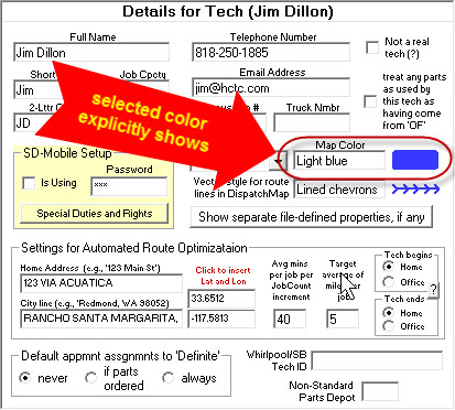
You may have already noticed part of this in the above illustrations.
Historically (and in regard to picking each tech's DispatchMap color), the Technician Properties window only offered you a verbal description of each color. In other words, you did not see the actual color (and had to go into the DispatchMap afterwards, to see the actual color you'd selected). Now (as you can likewise see in illustrations above), the selected color is displayed to the right as a colored "blob":
Better than the above, we've enhanced the dropdown list from which you may pick a color. Formerly, it just listed the verbal descriptions of colors (leaving you to potentially wonder what each described color might actually look like). Now, the list shows the actual colors directly:
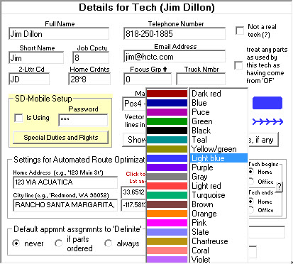
Besides the obvious benefit, it's possible there is another. Many times, users have asked for more colors from which to select. As previously mentioned, we've not managed to come up with more than is above-shown, in regard to colors that: (a) readily distinguish from one another; (b) distinguish well from a white background; and (c) are not harsh to the eyes when viewed on a computer screen.
If any of y'all want to "give it the old college try" (i.e, seek to come up with one or more added colors that meet the above-described criteria), we invite you to do so. This is a website you can use to try various mixes of red, green and blue -- to see if you can formulate any new mix that fits the needed bill. If you can, please let us know what is the particular mix you've found. We'll be delighted to add any good new color to the selection.
Alert Dialogs Converted to "Toasts"
Okay, we admit it: ServiceDesk is a nag!
At least, if you're not "on the straight and narrow" in terms of such system setups and procedures that, from our perspective as designers, we believe is in your best interest, we've designed the system with intent for it to try to pester you into compliance.
Really, as designers we're trying very much to help you, so ServiceDesk has a ton of elements that watch for things, and will occasionally pester you with disruptive message dialogs, asking you to pay attention to some matter that we think you likely should pay attention to.
Regardless, we've realized there is a nicer way to nag.
For a bunch of "nag" messages that used to potentially interrupt your work, we've switched to instead using what programmers call a "Toast." It's simply one of those little flags that appears suggesting that . . . you know . . . maybe you might want to pay attention to the matter that's being "toasted" -- when you get around to it, when it's convenient for you, and perhaps when have an interest in doing so!
Though the actual text within will vary, our new "Toasts" look like this:
They can be simply ignored if that is your preference, or you may click on the toast and read, essentially, what would have been the explanatory dialog if we'd not switched to Toasts. A click for info of course causes the Toast to go away.
Also, each Toast is self-expiring after five minutes. We're trying to strike a better balance between having ServiceDesk engineered to help you help yourself, versus that very effort in itself being too intrusive.
At this point we've converted a dozen or so formerly-disruptive nags into Toasts instead. It is on our agenda to convert several more.
Option to Exclude Particular Jobs from Receiving Parts-Assurance Messages
A few months back (see here) we introduced a feature whereby you may setup so that ServiceDesk will automatically send periodic messages to your customers -- when waiting for an excessive period for parts that are on order -- assuring that you've not forgotten them, are still waiting to get the item(s) from the manufacturer, etc.
This new feature has been warmly received. We're told it's done much to reduce office burdens, to reduce the level of customer frustration, and to enhance customer confidence in the company.
Regardless, it appears some consumers have expressed to some Rossware users a preference to opt out from receiving such messages. Rather than any more elaborate GUI-based switch (which requires considerably more coding investment), we're created a sort of "back door" method by which you can designate for that. Simply, in the ExtraNotes section of a job record, insert a pair reverse chevrons, like this:
<>
When ServiceDesk is otherwise sending parts-assurance messages and sees that precise pair of characters (the pair can be located anywhere in the ExtraNotes), it will know to refrain from sending a message as connected to that job.